Venmo Split
For a long time, Venmo did not have any bill-splitting feature. Users manually added up each person’s total and sent out individual requests. Venmo Split streamlines this process.
Key Features
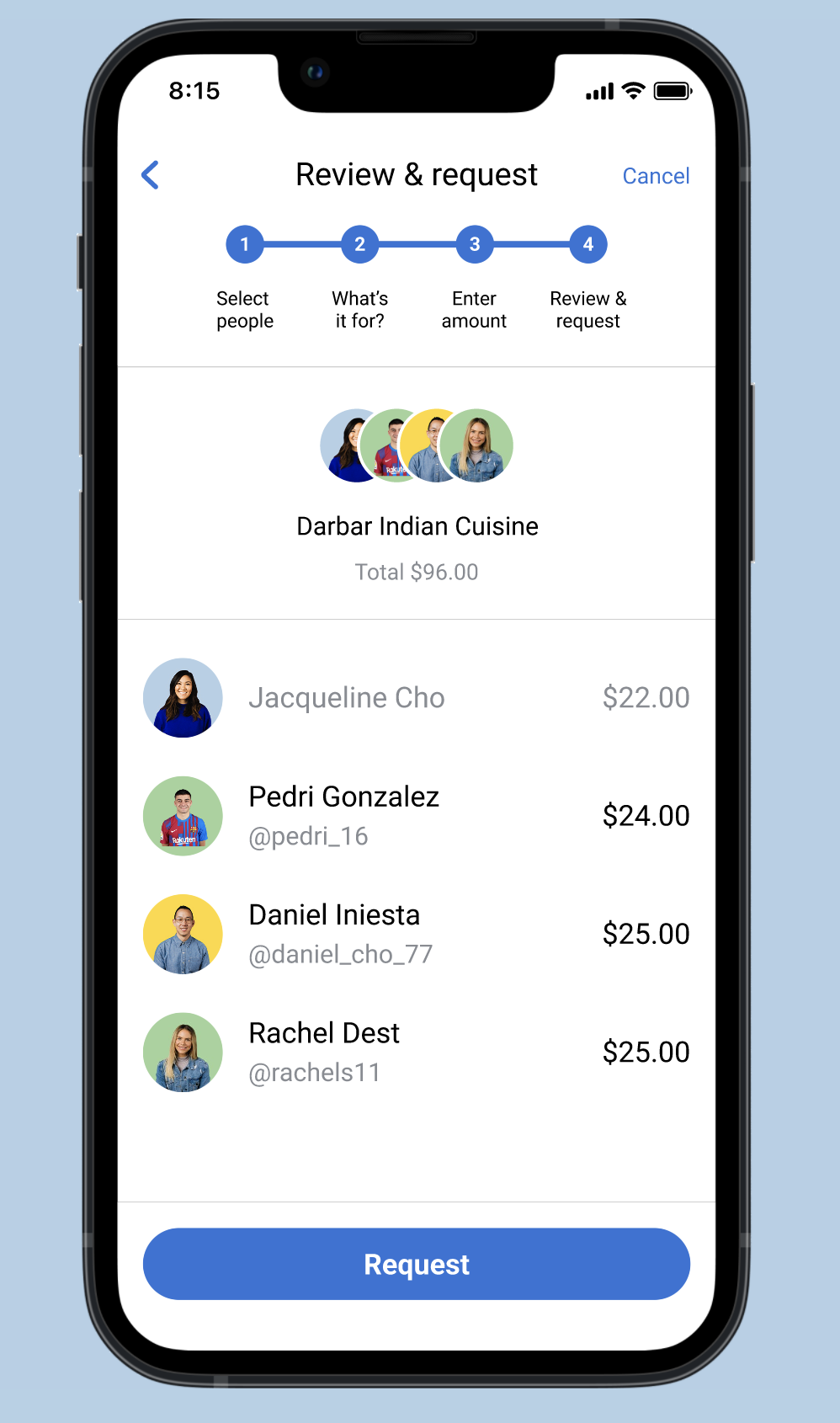
Select multiple friends to easily send requests to


Choose between an equal or proportional split
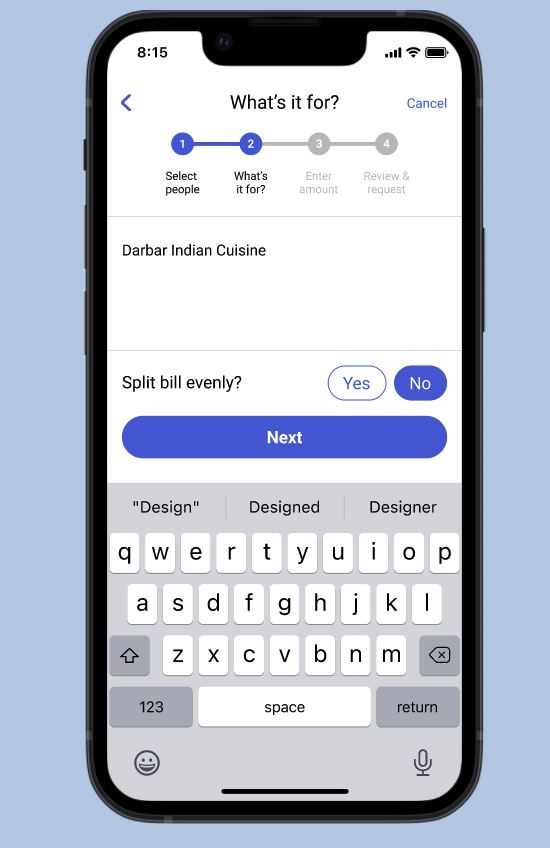

We’ll do the hard math. Just enter in each friends’ total plus the group’s tax and tip.

Request everyone with one click
Summary
Our users needed a way to split a dinner bill that was less tedious than individually adding up each item and then accounting for proportions of tax and tip. To streamline this process, we designed a feature that integrated all of that and fit with the existing Venmo design language.
Time Frame
3 weeks (February 2022)
Team
John Hong, Steven Trinh, Ryan Oosting
My Role
Wireframing; Rapid Prototyping; User Interviews + Testing; Iterating
Methodologies
Figma

Paper Wireframes
Our goal was to take Venmo’s existing platform and make it more logical. We wanted to make the landing page more user friendly and introduce a function to split a bill. But before stepping foot in Figma, we created some paper wireframes.

Digital Wireframes
After creating and running through our paper prototypes, we recreated them on Figma as medium-fi wireframes. We played around with the landing page layout and how to best display the notifications before moving on to user testing.

User Testing
We tested our med-fi wireframes on regular Venmo users so they would be familiar with the current app and since they were also our target user group. Their feedback was overwhelmingly positive though there were some small bugs we still needed to sort out.

Design Changes
Based on our user testing and observations, we identified areas to iterate on. This is a sample of some of our design changes we made. Notably, these changes improved the user experiences.

Final Product
After multiple rounds of prototyping and feedback from test users, we created a rounded final product. It looks similar to Venmo because we wanted to maintain its current design language but aimed to make the interface more user friendly.